Creating the experience that represents the heart of the community and stays as a manifesto of it
After the biggest challenge that all the hospitality industry had to face during the Government restrictions, on 15 April 2021 a new idea was taking place in Fradshom, Cheshier.
I was called to create a new website for the new Bar, which that born as a solution to stay in business to one of the iconic social/art hub pub in town.

Tha’ Dogg House is Frodsham’s first outside venue providing street food, drinks, and vibes!
The challenge was a perfect storm for a UX research case, I was digging into the emotional behavior for socializing again after a long period of time.
Case of Study
New bar wants to create a website to have a presence online.
Simple
Accessible
Understanding of their target users.
Task
Design a new website for desktop.
Informative and interactive.
Goal
Design and build a online website that can be tested with users.
The tools
Survey Monkey
Figma
Miro
WIX.COM
Duration
10 days
My Role
UX Researcher / UX Designer. Web desing
The Process
Bring it to life
The Challenge
Identify the motivations of the customers to go bar to the public venues after long periods of lockdown. How to integrate the soul of the community with a new concept bar.
I looked at how other bars, top of the industry, solve this problem (benchmark), I performed usability tests, applied Online surveys, and master the note-taking techniques for this research case.
I used that information to focus my research and ultimately improve the quality of my designs.
Goal #1: Design and build a clickable prototype that can be tested with users, along with a detailed set of wireframes.
Goal #2: Create a design that has the intention of resolve the issues around the pain points identified in the research and analysis.
Project Goals
Research
Learning about our customers


BENCHMARK ANALYSIS
5 Top leaders of the industry, Benchmark analysis:

ONLINE SURVEY
50 Users respond to an online survey

USABILITY TEST
3 Usability test / Note-taking
BENCHMARK ANALYSIS
What are the best practices of the industry?
As a starting point, I reviewed Hotels-related websites to see what they’re doing well that I can emulate when it comes to designing my own room booking process. Most of the websites were Hotels, but I was also interested to see if I can learn anything from other types of booking platforms, such as Booking.com.
During my benchmark research, I came to realise that for a relatively simple task as finding and booking a room, many different solutions exist across Hotels websites. This made me wonder how users are interacting with the different booking experiences and I kicked off my user research to understand their needs and pain points better.


ONLINE SURVEY
How do you feel about visiting a pub just after the lockdown?
To learn more about the goals of people that use hotels websites and apps, I created an online survey. Ideally, I would have placed this survey on a Hotels website to intercept people as they’re using the software. In this case, I sent the survey to friends and colleagues instead (who have used an Hotel website within the past 6 months).
Key findings:
-
The primary user goal is to research book a room, followed by check rates and the hotel information.
-
Value for money is the most important factor when booking a room
-
Users want to find clear information about the hotel and the conditions.

INTERVIEWS & USABILITY TESTS
Confusion, distrust and mistakes -
the common themes of booking a room
To dive deeper into understanding hotels customers’ mental models and behaviours, I conducted in-depth user interviews, followed by comparative usability testing sessions. During the sessions, users completed the same room booking tasks on two different Hotel websites.
It was surprising to see that none of the participants had a straightforward booking experience. Even people who are frequent travelers struggled with some of the steps along the way. Although their pain points and frustrations were different, they were all related to selecting the right type of room and fare type and booking conditions.
Data from the different research sources
Analysis
Key insights form the researched data
Usability Test (data)
Benchmark (data)
Survey (data)
Note Taking (data)
Affinity diagrams
Journey Map
Identify Patterns
"A perfect formulation of the problem is already half of its solution" David Hilbert
AFFINITY DIAGRAM

Brainstorming ideas, analyzing the data, and driving consensus.
Understanding the problem
through collaborative analysis
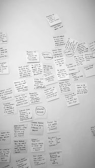
Having a good amount of data from my user research allowed me to collaborate with a fellow UX designer to get to the root of my findings. During the affinity diagram session, we worked together to put structure on the large volume of qualitative data from my research.
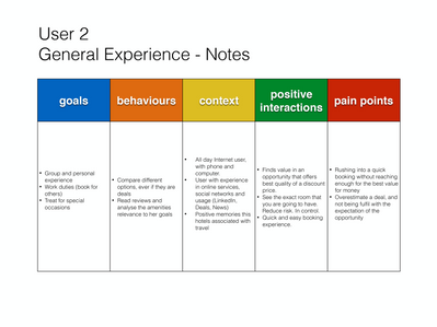
On this board, we’ve gathered the goals and mental models of users, as well as their behaviors, pain points, and positive feedback. In order to understand the directions I would need to take with my design, we arranged the data in categories that reflect each step a user would usually take during a booking process:
-
Motivations
-
Planning
-
Browsing site
-
Hotel INformation
-
Evaluation
-
Selection Process
-
Add On's
-
Payment
CUSTOMER JOURNEY MAP
Leaks in a reservoir of goodwill
Building on the affinity diagram findings, I created a user journey map to put even more structure on my research data. This allowed me to visualize the problem areas of the existing user journey:
-
Understanding the Hotel information can be too complicated
-
Selecting a room option can be confusing
-
Add Onz can be overwhelming
It became clear to me that users are expecting to see a clear answer to their search, but instead, they are presented with too much information and too many options to consider which causes confusion and frustration.
During the room selection process, their primary goal is to find the best value for money and that they are not missing any opportunity. Users want to feel in control.
The Information Architecture is key to help the users to reach the information they are looking for quickly and navigate them smoothly through the process.
Any Add On or extras should be relevant to the user and well described.

With a customer journey map, we highlight aspects of the journey that need to be fixed as a priority
The design process will incorporate patterns of positive experiences and resolve areas where pain points were identified.
Any interaction of users with the design must complete a task or micro task that helps them achieve their goals and contemplate their behavior.
Key Insights
GOALS
PROCESS FLOW
-
Not relevant results in search
-
Up-Selling feeling, extra steps
-
No Standard payment flow
SCREEN DESIGN
-
Too much scrolling, not easy to find information
-
No clear booking cancellation policies
-
Too many options without a clear difference
-
Personal information concerns
POSITIVE EXPERIENCES
PROCESS FLOW
-
Quick and Easy Process
-
Be in control of the process
SCREEN DESIGN
-
Clear booking condition from the start
-
Only relevant information display
-
Visual process & HD Images
-
Ratings / Reviews
-
Deals = Value for money
PAIN POINTS
PROCESS FLOW
-
Not relevant results in search
-
Up-Selling feeling, extra steps
-
No Standard payment flow
SCREEN DESIGN
-
Too much scrolling, not easy to find information
-
No clear booking cancellation policies
-
Too many options without a clear difference
-
Personal information concerns
BEHAVIOUR
PROCESS FLOW
-
Desktop flow is prefered vs mobile
-
Most users will discuss / compared and/or share the information before booking.
SCREEN DESIGN
-
Enough images to get a good understanding of the option.
Design
User Flow & Scketches (Low-Fi prototyps)
User Flow
Primary USE CASE: User booking a room
Before I design screens,I have to step back and consider the structure of your software and how you want users to flow through it.

As I started to define the low-fi user flow for my primary use case, It became clear that I need to simplify the information required in each step of the user, have a clear proposal and statutes of each screen in the process.
Users want to feel in control, have all the relevant information telling a story so each step should be predictable and perceivable.
OBJECTIVE
To minimize the number of sreens the user needs to go through in the process and utilize the different "states" of each sreen (e.g. payment information and contact information in the same Payment Page)
Use of smart defaults (e.g. 1 room, 2 guest) to minimize the amount of actions and a quicker flow
Digital affordances like "one calendar displayed", that stays open until both dates (arrival/departure) are selected to predict the next step.
Linear flow with the use of constraints that limit the alternatives of modifying data, such as slecting dates after choosing the room.

Sketches / Low-Fi Prototypes
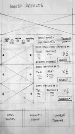
With the primary user flow defined,I started to capture my ideas by sketching low-fidelity screens
using pen and paper.

By the use of paper prototyping technique we can analyze and determine:
-
Key user interactions such as pop-up windows, drop-down menus, calendar display. It became very useful to determine the right size of the calendar, after many iterations.
-
Elevations and shadows. Shadows show surface edges, surface overlap, and the degree of elevation.
-
Opacity shows surface edges and overlap, but not the degree of elevation.
Prototyping
Bringing sketches to life
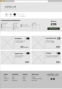
Once I had a visual direction for the website layout, I started to add more details and precisions to the sketches by turning them into mid-fidelity screens. On these screens, I included elements that directly address user goals, needs, frustrations, while incorporating common design patterns seen on other hotels websites.
Key design intentions
HOME PAGE
-
All relevant information is shown on the first screen, without scrolling.
-
Navigation through tabs for the content (hotel information)
-
Central searching menu to start the booking process.
-
This design intended to prioritize the main USE CASES
-
Visually predictable

SEARCH RESULTS PAGE
-
Only the main features of the room are displayed, and the tose that make it a unique option.
-
Progressive disclosure, prevent information overload
-
Expanded menu for more information or photos
-
Progression bar for feedback
-
Dates selection, stays in the same position as the previous screen. But now the interaction description changes to UPDATE instead of search.

ADD ON PAGE
-
More information can be access on the same screen by the expanded menus and carousel galleries.
-
Toggle ON/OFF for quick visual response
-
All relevant information of the booking in a central position
-
Constraints: Dates can not be updated at this point
-
Users can skip the Add Ons by confirming the booking in the main interaction of the screen.

PAYMENT PAGE

-
All relevant information of the booking in a central position
-
Clear "Call To Action" with a relevant description
-
All field with correct imput type
-
In-line validation
-
Name on card = Contact Name, by default. User can change it if necessariy.
Wireframes
The Devil is in the details
Iterate And Improve
This job is never easy, you can never be too sure that your hypothesis is correct. I used a variety of assumptions to build my prototype with complex features.
So I rely on the process of Iterations to get the final wireframes just right.
After performing a new usability test with users, I modified or change many sections of booking process and pages design.
-
Navigation with tabs on the home page was not so predictable. I modified the font size and aliment of the title, to help the data structure.
-
The size of the calendar displayed was modified
-
Changes on the copy
-
CTA positions
Final Thoughts
This process has been a learning curve and recognition of the fantastic nature of human beings. Surprising users with a successful design is an ambitious task. But understanding how we behave, identifying reactions, and charting the emotional path of users, is even more so.
UX design methodologies help to frame the research and development of digital systems to achieve emotional empathy with users. The challenge is great, and educational programs such as the Professional Diploma in UX Design from the UX Design Institute are fundamental to my development as a UX designer.


